Loading
Loading
case
case
study
study
2023
4 weeks
Product design
Profi.io is a platform for coaches, trainers and their clients. The product simplifies operations by offering tools for managing schedules, payments, and services. There are also auxiliary tools, such as forms, automation, chats with clients and reports.
The client’s work with the coach takes place in the client part of the platform, where the client has access to information about his sessions, forms, programs and packages.
Problem
Customers believe that the current client portal doesn't make clients progress well. Clients have low completion rates in programs and packages, frequent missed sessions and forms. Clients simply don't understand what they should do.
My task and role
As a product designer provide the team with a client experience concept that would increase the engagement and completion rates of services. Valya Tkalenda (PM) and Anastasiia Pozdniakova helped me with discovery and validation stages.
Context
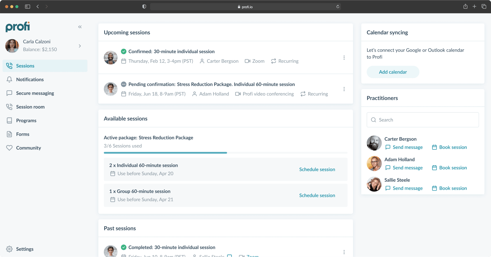
At the moment, the portal is designed in such a way that sessions are at the forefront, they are also the client’s home screen. The reason for this is historical — initially there were only sessions on the platform and it seemed that there was no more correct way than to start working with them.
Clients can work with coaches from different companies. Sessions, programs, forms and packages details, as well as chats and notifications, are aggregated in the main navigation.
For a long time, the client portal did not receive updates, because the team was convinced that the main focus should be on customer tools, while the client experience was secondary. Having email and SMS notifications, as well as connecting own calendars, should make it easier to deliver important information to clients. Guys from research team decided to find out what the state of the client’s current experience is and, as it turned out, everything is not so simple.
Discovery
Questions to answer
What difficulties and pain points do clients experience when using the platform?
How does this affect the entire coaching process?
What requests do we have from customers?
Why are they important to them?
How are current problems solved by competitors?
How important is this task for our business?
What I did
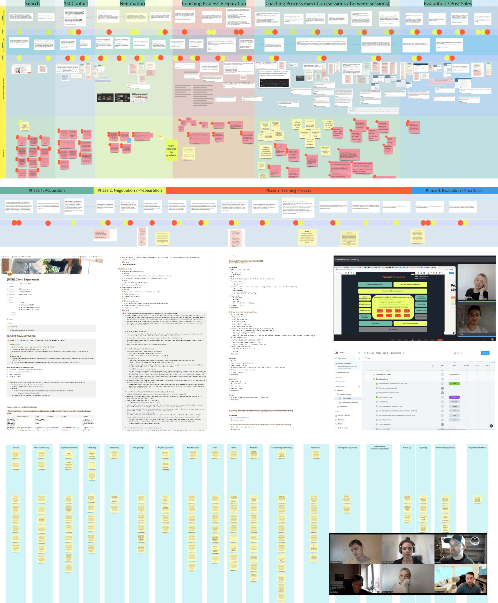
I studied 100+ requests about client experience on ProductBoard.
Analyzed insights from clients and customers interviews, conducted by our research team.
Personally interviewed leads of Sales & Customer success teams.
Conducted UX-test
Competitors analisys
Findings
The purpose of the portal is to facilitate the client’s progress. Progress is the client achieving approved goals through completing tasks.
Clients have little interest in studying the portal, are poorly oriented in it, which is why they don't complete tasks and don't achieve their goals.
Customers want to have more abilities to define what their clients actually see at the moment. They want to manage their attention.
It's important for customers to constantly remind clients of their goals, because goals are exactly what the client comes to coaching for.
Customers want to express the brand and the terminology accepted in the company in order to create a feeling of a unified information environment.
Customers would like to help new clients get comfortable on the platform and guide them through tasks and materials at start.
Customer experience is an important criterion in making product purchasing decisions.
Clients miss sessions because they forget to connect their calendar, turn on notifications, or even just how to get back to the platform.
Evaluation current experience
Since we didn't want to carry the problems of the old portal into the new one, we conducted a moderated usability test with 10 clients — 5 each for the desktop and mobile version of the portal. We were interested in whether clients would understand what they needed to do (go to the program, submit a form, confirm a session request) and whether they would have a clue how to contact their coach.
100% of respondents noticed and interacted with the session offer banner, as it appears on the start screen and is located at the very top 👌
Only 60% of respondents on the desktop guessed that the red dots in front of the sections are a sign of updates and went there, having found the program and form there. On the mobile version, only 1 respondent out of 5 managed this task, the rest simply did not pay attention to the "hamburger" in the top corner of the screen.
100% of respondents on the desktop were able to contact the coach by going to "Messages", and only 50% managed this task on the mobile version. This is due to the low visibility of the menu, but on mobile the "My practitioners" block located on the home screen helps. Those who scrolled all the way to the bottom were able to complete the task.
Observations
Only 40% of respondents were able to fully understand what they were required to do right now.
Respondents searched for answers on the home screen, with little enthusiasm for exploring other pages.
It was difficult for respondents to communicate with their coach due to navigaton issues on mobile.

How might we make client portal more customizable, discoverable and efficient to achieving clients goals?
Ideation
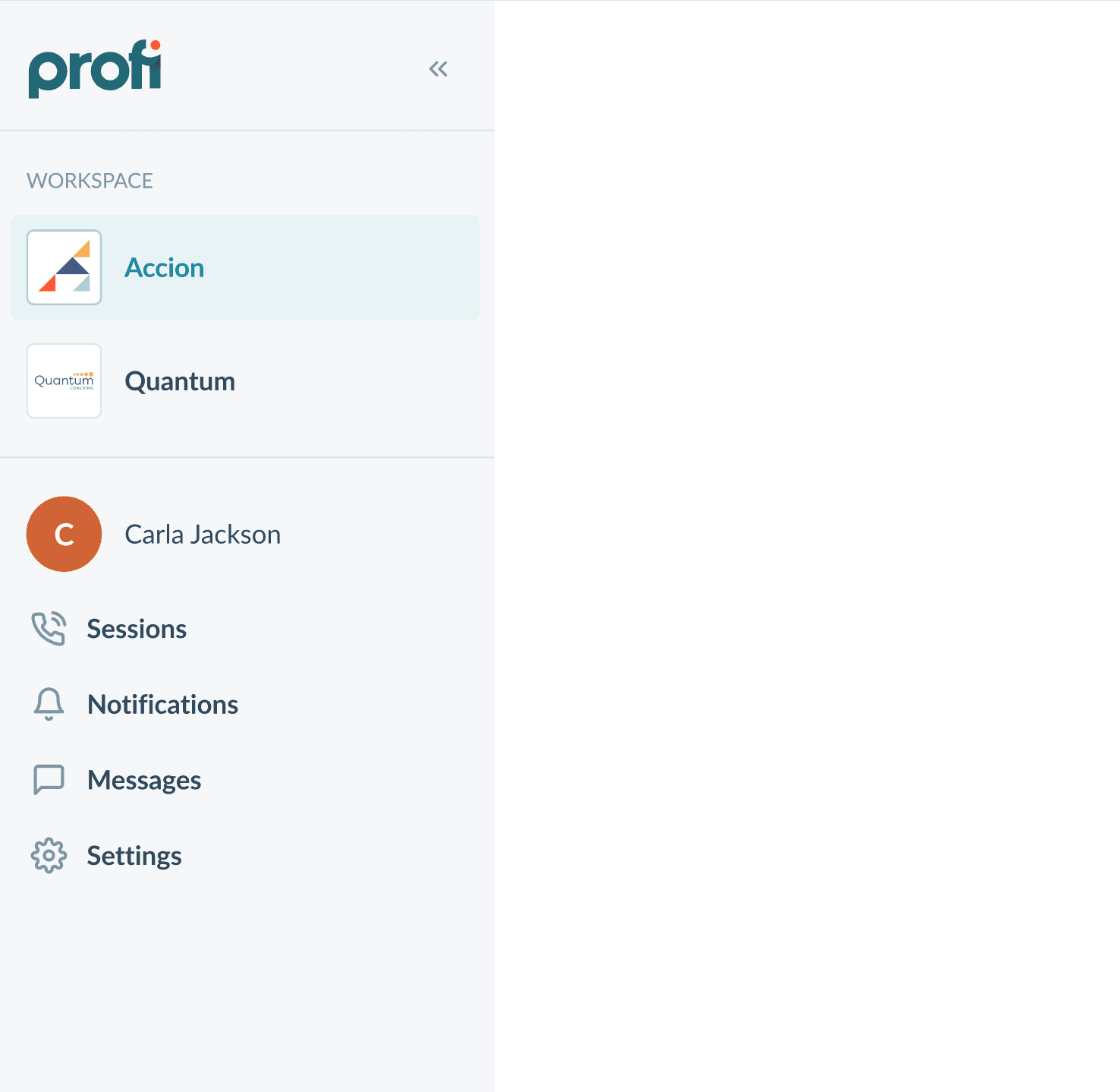
Aggregator → Workspaces
To provide the client with a unique experience with a company we could split the portal into separate workspaces, so clients will have a unique home page with each company, customized especially for them. Company logos in the switch will further express their brand.
We decided to keep a few sections where content would still be aggregated from different companies to quickly assess the overall situation.
Each workspace has a different order and titles of widgets. This allows Admins to manage what the client will see first and use the terminology accepted in the company. I also added a Cover image customization to make the workspace more recognizable.
Pages → Actionable widgets
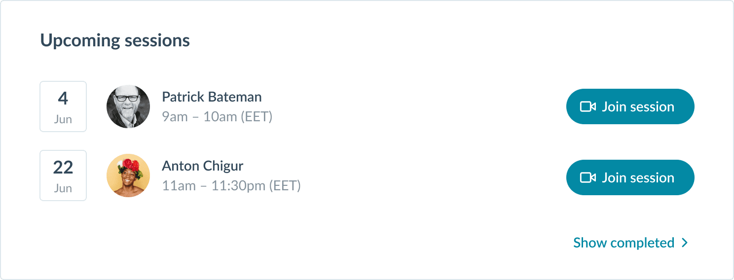
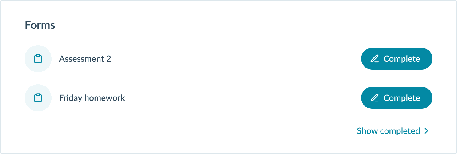
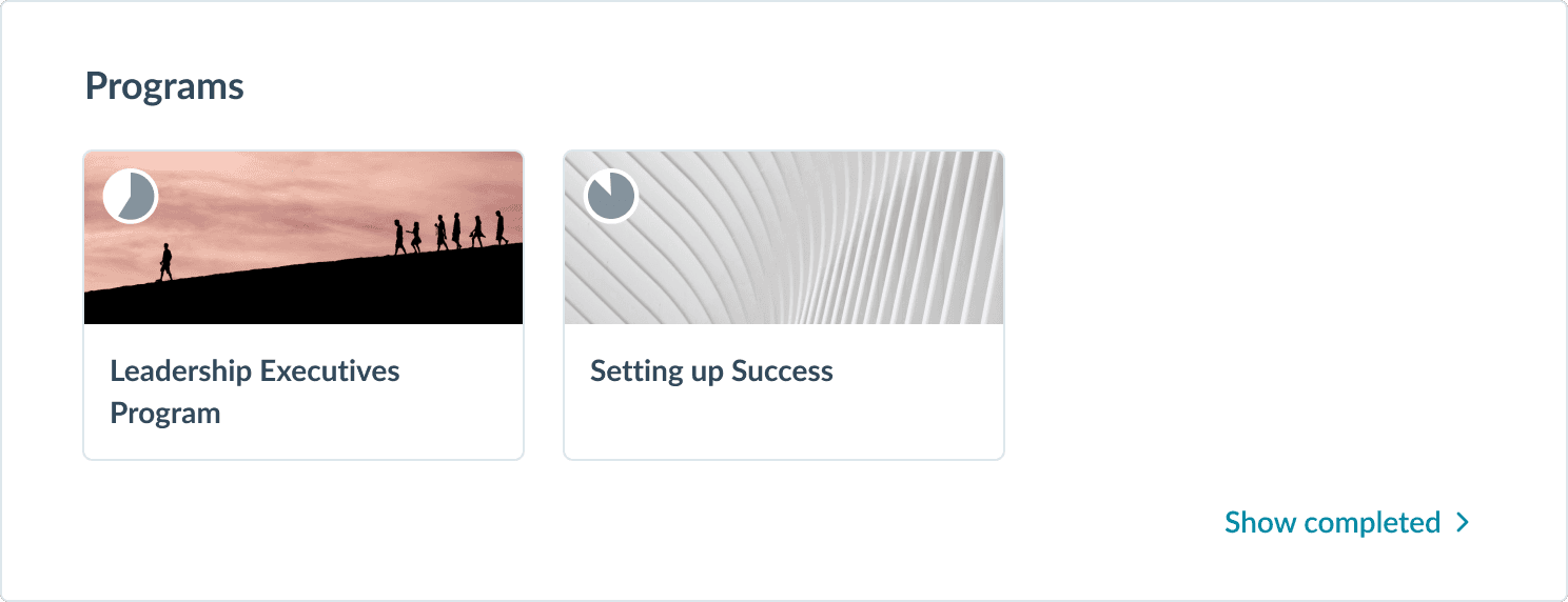
The client will no longer get lost looking for what they need to do. Instead of wandering through pages, he sees all his stuff at glance. I highlight only those objects that require action, hiding everything else.
Custom widgets order
The company prioritizes the data for the client and thus manages their attention.
Custom terminology
Any widget can be renamed according to the company's terminology.
Hamburger → Bottom menu
Messages and notifications are now always in front of your eyes and in a handy place.
Before
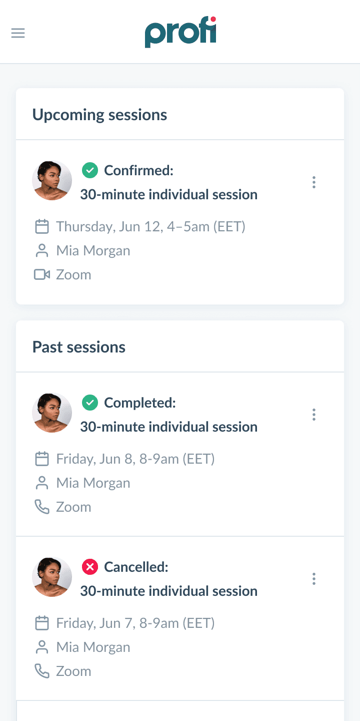
Since navigation is hidden clients rarely discover their programs and forms, and past sessions piling up push useful blocks far down.
After
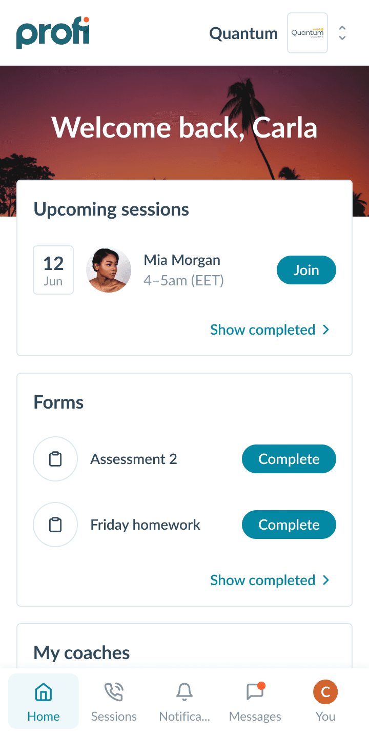
Navigation is placed in the bottom bar, data is prioritized by admin, and the focus is on what is to be done.
Onboarding tasks
In addition of problems, mentioned in Findings (8), clients often end up in an empty portal when they don't have sessions or programs yet. A simple onboarding widget could engage them on this point.
Validation
Client experience
As in the current experience evaluation, we tested desktop and mobile versions (5 respondents each). We tested the same scenarios as the first time. Changing workspaces was not taken into account; all of the respondents’ work was carried out in a single workspace.
Confirm session request
80% completion
Open current program
80% completion
Submit a form
70% completion
Write a question to the coach
100% completion
Respondents interacted well with Tasks. They immediately noticed them and most often perceived it as the entire list of tasks that they needed to complete.
Some respondents did not scroll through the remaining blocks, such as “Sessions” or “Forms”, simply completing onboarding tasks.
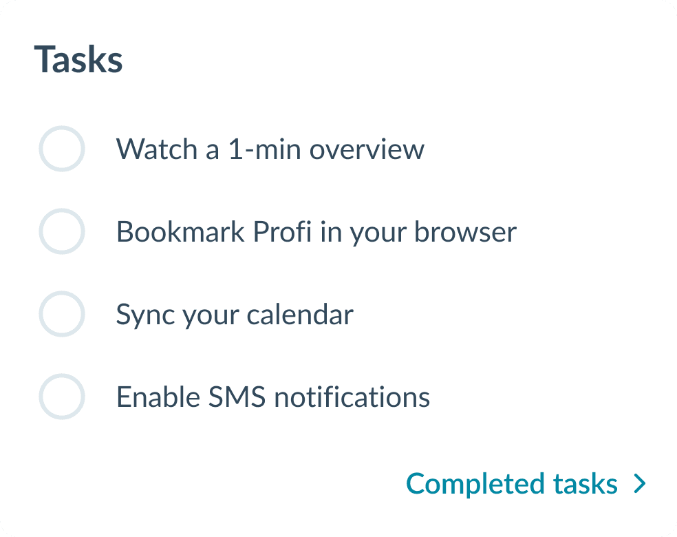
Many respondents liked the way the interface looks when there are no tasks. They felt a sense of satisfaction and relaxation.

All respondents were confused by the navigation. It was absolutely discoverable on mobile, but raised questions about why pages contained information from different companies. People believed that these pages were specific to the selected workspace and were confused about where to look for sessions - in a separate page or in a workspace widget.
Solution interview
We showed the solution to 3 of our largest customers and here's what we learned.
Customizing the order and names of widgets
No goals tracking
Profi and other companies brand expression
No color scheme customization

So how might we improve client portal customization and efficiency in achieving goals?
Ideation #2
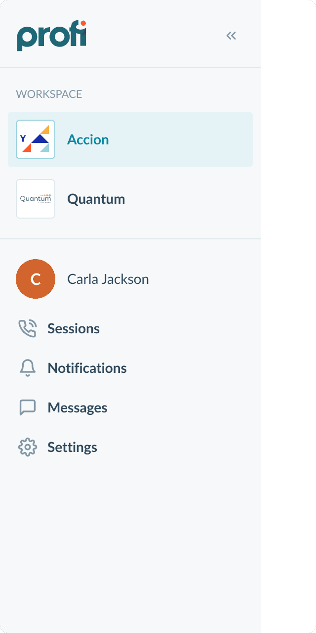
Emphasis on the company brand
Now the platform reflects the brand of the selected company, the Profi logo is hidden, like the logos of other workspaces.
Workspace-specific navigation
No confusion anymore! All pages with historical data are relevant only to the active workspace. Customization of terminology fits perfectly into this solution.
Before
Now
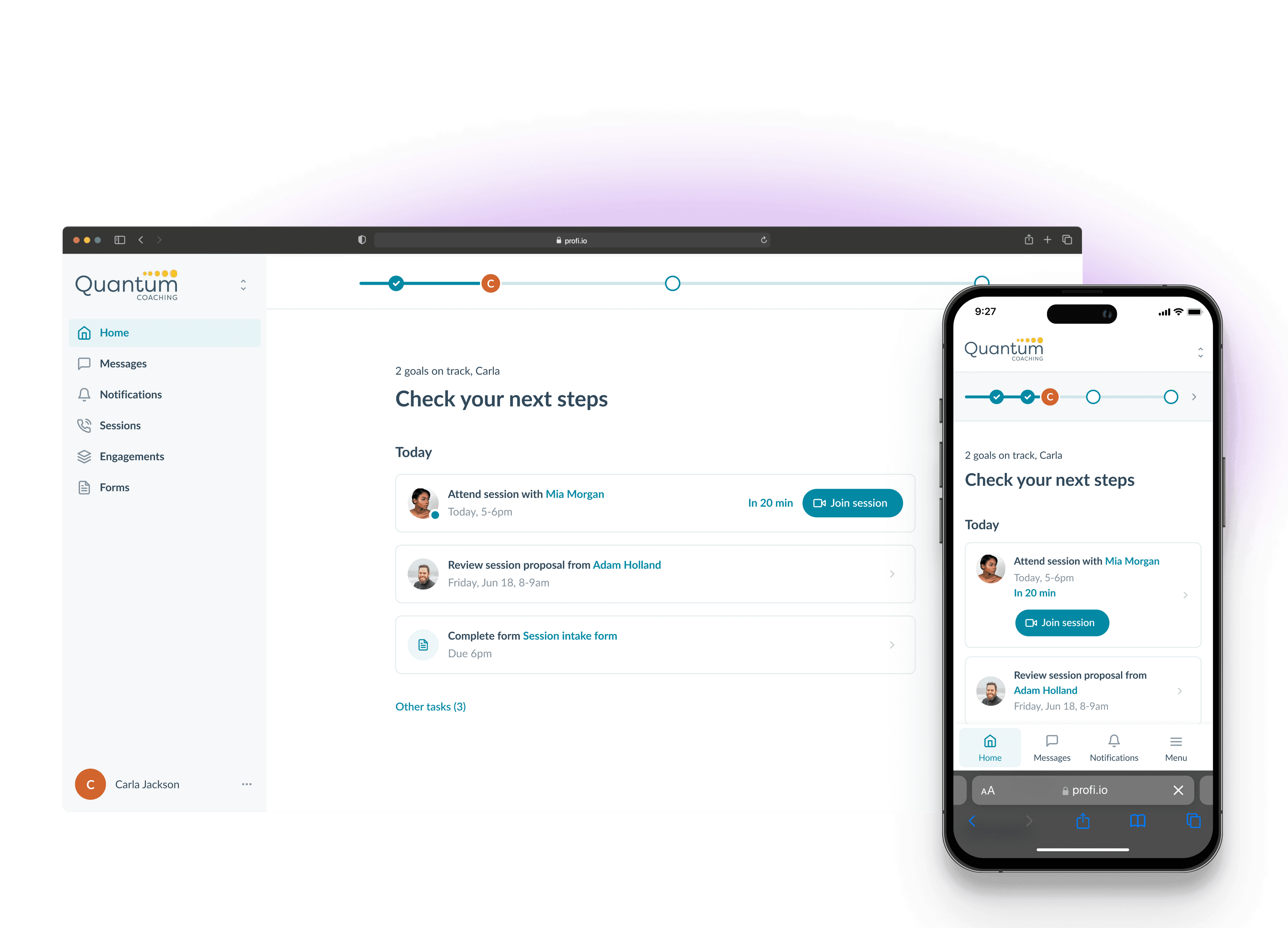
Widgets → Tasks
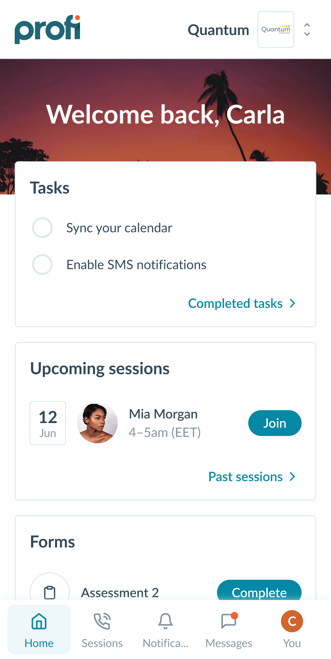
What if all the client needs to do is a task? Sounds obvious, doesn't it? The unexpected success of the tasks widget made me think that not only onboarding tasks could be there, but also everything else that is required action from the client right now.
Before
Now
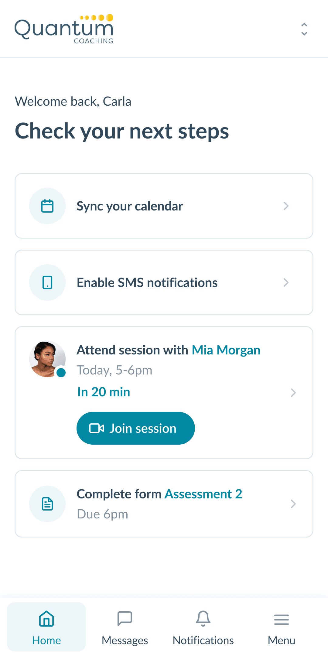
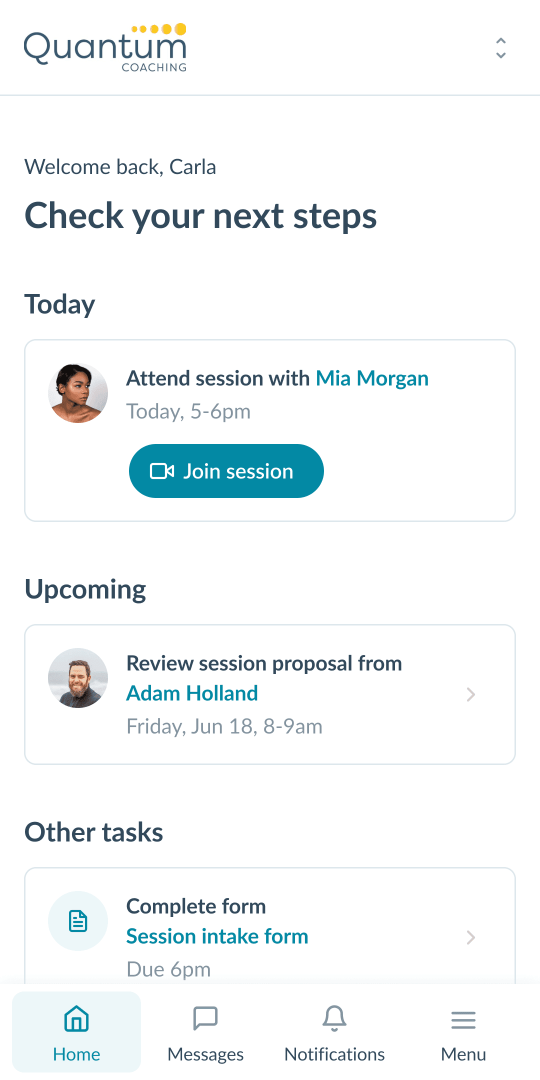
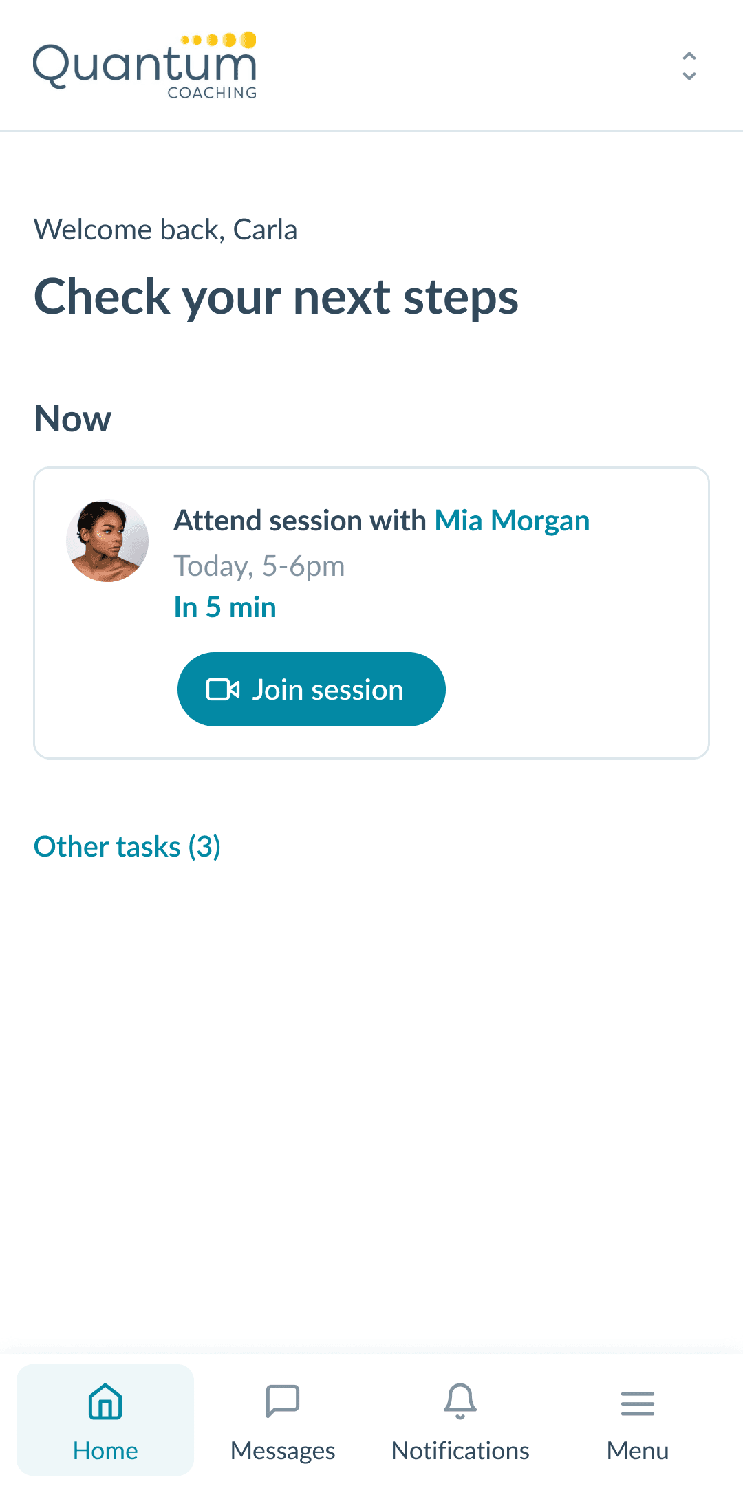
All tasks are equal, but some are more equal than others!
The client may ignore some tasks, as a result of which they will accumulate and he may miss something really important.
Goals tracking
I went through several approaches to visualizing goals and formed the criteria that the design should meet.
Goals must be always before your eyes, because this is exactly what clients come to coaching for.
Goals should not distract from tasks, because without completing tasks there will be no progress.
Goals track doesn't distract from completing tasks, while constantly reminding the client of where he is right now on their path.
The coach sets each task's contribution to a related goal, and the client sees how he will get closer to the goal by completing the task, which should motivate him to do it.
Theming
Now the company can specify its corporate color and fit the platform into the general set of tools for working with clients.
Validation #2
Client experience
Confirm session request
100% completion
Open current program
100% completion
Submit a form
100% completion
Write a question to the coach
100% completion
Discovering goals
40% completion
Solution interview
Navigation customization (title, position)
Goals tracking
Brand expression
Conclusion
Testing has shown the design to be very good at helping clients complete tasks efficiently. Companies will be able to customize workspaces, creating an organic environment for their clients to work together. The team also liked the concept. Development is planned for Q2 2024.
To solve UX problems with Goals Track, I designed an onboarding for the client during the first registration. Unfortunately, I didn't have time to check it out, but in my opinion it makes a good impression. How about you?
